 PLN
PLN BRL
BRL CZK
CZK EUR
EUR EUR
EUR EUR
EUR EUR
EUR GBP
GBP RUB
RUB SEK
SEK USD
USD


We know the colour of the year 2020 – Classic Blue is Pantone Institute's most recent choice!
Many of us were initially surprised by how ordinary Classic Blue seems. We got used to thinking of Pantone's colours as real celebrities in the world of design. They were always quite striking and eye-catching. However, we now understand why this rather conservative colour deserves the recognition. Laurie Pressman, the vice president of Pantone, explained that Classic Blue is the perfect companion of our times – times of instability, increasing threat of conflict, and overdependence on technology.
The well-known hue of blue is supposed to become a source of calmness and security in 2020. It’s the colour of blue jeans we all wear, of blueberries, and the sky at dusk, said Pressman. Considering the above, the choice seems very appropriate. And regardless of its symbolic meaning, blue is a real winner in terms of interior design, as it guarantees gorgeous and stylish arrangements!
Pantone's choice for 2020 – the year of peace and harmony
You might be worried that a room featuring Classic Blue will seem a bit depressing. After all, that's exactly what "feeling blue" means. However, Laurie Pressman explains that these ideas about blue are largely outdated and the younger generations see it in a completely different light. The hue is now mostly associated with nature. All living beings share one sky which is a source of peace and harmony.

Classic blue as a symbol of serenity
What follows, Classic Blue is the perfect tool for building communal bonds with people all over the world. Furthermore, blue in interior design can be used to improve one's focus. The deep, subtle hue will shield you from the everyday sensory overload and let you take a deep, relaxing breath. We recommend using a few accessories in this colour or a stunning wall mural. See the effects for yourselves.
Focus on blue accessories in interior design
Before we move any further, we have to recognise how universal blue hues actually are. Winter 2020 is the perfect time to get used to this deep, royal colour, which will provide a wonderful contrast for the white blanket outside. Then, when the summer comes, the cold hues will become a much-needed respite from the scorching heat. If you wish to completely transform your bedroom, you should definitely go for a wall mural. The large format image in this colour will help you completely change the look of your room in a flash. Which designs are worth considering? We've prepared a few wonderful options depending on the overall style of your flat.
-
For glamour interiors, we recommend a design depicting a precious stone in the shades of Classic Blue. We have a few photographs of real stones as well as abstract compositions in the Liquid Marble style.
-
If you prefer raw, minimalistic or industrial spaces, we have a wall mural which looks like a canvas painted with irregular strokes of blue paint.
-
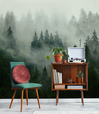
The Pantone Institute often draws inspirations from nature. When choosing the colours for your interiors in 2020, consider using atmospheric natural designs, which are perfect for traditional and rustic spaces. We particularly fell in love with a depiction of a deep blue raging sea.

Combining wood and sea colour makes for a stunning effect. At the same time, the design is subtle and harmonious - myloview.com
Wall murals are just one way to enjoy the fashionable colour. Another great idea for a subtle yet striking interior metamorphosis are posters or canvas prints. Geometric designs are going to be especially popular this year so there's no better time to go for some daring, abstract compositions. If you have a spacious interior, you can really go all out with a breathtaking, large format decoration. What else? Dark blue fabrics, soft reading armchairs, or designer plates in this colour will be all the rage this season.

A dark poster can serve as a great contrast for light furniture and accessories - myloview.com
2020 colour of the year – we know what goes best with Classic Blue
Pantone would never leave their colour of the year on its own. They always recruit a loyal group of companions that make it look even more dazzling. This time, the Institute decided to lighten up the dark hues of Classic Blue with delicate, pastel colour. Such combinations will make any interior look elegant and cosy. The colours create a perfect atmosphere for rest and relaxation away from social media and technology. So which pastel shades will be best in this case? If you wish to stick to one colour palette, we recommend accessories in greyish-light blue hues, sort of like the colours of forget-me-nots. However, you may also decide to break away from the blue monopoly and opt for peach or beige decorations. This combination will look marvellous, while preserving the feeling of peaceful harmony and that's exactly what the Pantone Institute's specialists had in mind when they chose Classic Blue as the colour of this year.

A darker wall mural can be used to dominate a space - myloview.com
It's the colour of popular blue jeans, of blueberries that we eat in the summer, and finally of the evening sky that we see after a long day at work. Pantone's colour of the year 2020 can be interpreted in many different ways. Regardless of your first associations, the hue will make your decor calm, elegant, and timeless and your room will become an oasis of peace and security.


Other articles

