 PLN
PLN BRL
BRL CZK
CZK EUR
EUR EUR
EUR EUR
EUR EUR
EUR GBP
GBP RUB
RUB SEK
SEK USD
USD


Colorful murals and canvas prints: how to select the best ones?
Selecting a perfect wall color – or the whole color palette for your interior – doesn’t have to be difficult. Instead of thinking about it as a long-lasting decision, it’s better to see it as an intriguing challenge! A challenge that, thanks to our help, won’t be as difficult as it may seem: we’ll share with you the secrets of our craft and give you some advices on how to use color in your interior.
 Pink mural for bedroom - Myloview.com, visualization prepared by: Ewelina
Colorful mural for a bedroom
Before we’ll start teaching you about colors, let’s remember that every interior – no matter if we’re thinking about a private apartment or an office interior – has its own functions and intended use. Some are dedicated for work (for example, an office – no matter if it’s in your own house or in a company’s headquarters), and some – for relaxation (a bedroom or a hair salon). In some of them we spend time alone or surrounded by our loved ones (bedroom), and some are supposed to make interactions with friends or family easier (a living room, a café or a restaurant). In other words: in some interiors, theoretically, we want to be focused and relaxed, and in others– energized. It’s worth to remember that while selecting colors for your interiors! But how to choose the right ones? Keep on reading to find out!
Starting from the basics - neutral shades on colorful murals
Oh, neutral shades… Some love them, others hate them. Among neutral shades we can find gray and beige, sometimes even black and white colors. Interiors fully decorated with neutral shades can be either extremely boring or incredibly stylish – the line is very thin. For example, in case of living rooms, neutral shades are worth to be used as a background that will make all of the color accents pop out and become more glamorous. Decorations like a sepia wall mural with a city will help you create a neutral base that can be combined with colorful furniture (couches and armchairs in intensive colors, or even the patterned ones are very trendy nowadays!), textiles and knickknacks. So, if you’re worried that a colorful mural or other such decorations are too much for now, start with neutral shades and gradually add colored accessories later on!
 City mural in sepia - Myloview.com, visualization prepared by: Ewelina
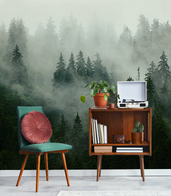
Murals in warm and cold shades, and colorful canvas prints
Instead of implementing every color of rainbow into your interior, you should limit your choice to either warm or cooler shades, depending on the function of a given interior. This is what we’ve mentioned before: Interiors dedicated to work or leisure? Warm colors! Interiors for relaxation and tranquility ? Cooler shades! Here’s an important thing: you don’t have to follow a common opinion and perception of a given space – pay attention to your own experiences! If, for example, your kitchen is a place where you relax best, don’t hesitate decorating it’s walls with cooler colors. You can decorate it with a turquoise canvas print, which will harmonize nicely with metallic appliances.
Look down - a colorful mural for floors
Floors are one of the most ignored interior elements – which is surprising, seeing as they’re one of the biggest splotches of color in every room! If you’ll decide to decorate one, or all, of the walls with a given color, make sure that the colorful mural or paint matches the shade of the floor. If the floor in your apartment is very characteristic or expressive, a colorful mural may be too much. It may be a better idea to paint your walls with neutral shades and decorate them with intriguing accessories, like abstract canvas prints or any other colorful canvas prints. In case of truly intensively colorful or patterned floors, a good choice would be sepia canvas prints.
Add character to your interior by using murals and colorful canvas prints
Not many of us live in a palace or at least in a stylish, monumental townhouse: most of interiors look very similar, especially the ones in apartment blocks. Such monotony is a great reason to use decorations like single-colored murals with original eye-catching shades and colorful canvas prints! If your apartment has some “good genes” in form of interesting architectural details, or at least interesting windows, almost every color will look great on its walls – a good choice would be either a cheerful colorful canvas print with squares or charming sepia canvas prints. Bright, calm and neutral shades will help to focus attention on the best features of your interior. But, if you live in a common type of apartment, you will have to make a bit more effort: decorate your walls with something more “spicy”, something that will take attention off of the lukewarm “features” of your interior! We can use turquoise canvas prints (this shade has been trendy for the last couple of years and we can assume it won’t change for many more), a mural with an intriguing pattern, or even an entire mini-gallery of interestingly framed canvas prints, posters and pictures.
 Colorful triangles canvas print - Myloview.com, visualization prepared by: Ewelina
Don’t know where to start? Start from the end!
It may seem like an unusual advice, but sometimes it’s best to start decorating your apartment from… wall decorations. Do you have a favorite painting? Maybe one of the murals stole your heart? Combine them with remaining elements of décor by using fitting colors. If you think that it seems like a weird idea, then you’ll be surprised to learn that this is how many professional interior designers work: this way an arrangement turns out surprisingly consistent!


Other articles


